


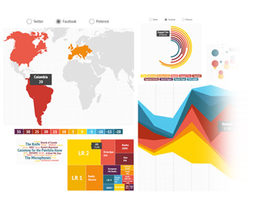
What is Data Journalism?
Journalism which uses publicly-available data as a basis for reporting. It is also sometimes called ‘data-driven journalism’. – Macmillan Dictionary
Data Journalism is telling stories that are based on concrete data. – visual.ly
Data journalism at the Guardian: what is it and how do we do it? – A 10 point guide to data journalism and how it’s changing
Why do we use Data Journalism?
- Simplify Data
- Visually Appealing
- Engage Audience
- Encourages Sharing
- Organise detailed information
- Highlight important information
Finding a Story in Data
One of the hardest aspects of data journalism is filtering through the masses of information you can sometimes be presented with and finding the story within it. In this exercise, we’ll take some readily available data published by Bournemouth Borough Council and turn it into a news story, complete with visualisations.
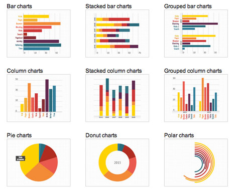
Infogram
To create data visualisations with a some nice visual appeal we’re going to use Infogram
- Open Infogram and login (Signup if you don’t have an account yet). To start a data visualisation, click on the ‘Library’ button, ‘Dashboard’.
- Select a template for your visualisation.
- Add the title “BBC Spending TV” to your chart.
- Click on this link and download all the spreadsheet available.
- Move between the Page and Settings tabs on the right hand side to customise the template.
- To upload your data, you will need to: Double click on the chart that you wish to customise > Click on Upload File > select the spreadsheet from your computer. Repeat this step for each chart.
- To style your visualisation, you can select each element you wish to change. The options panel to the right hand side will change in reason of which element you selected (Text, Chart etc..).
- When finished, click on the Share button on the top right > scroll down and select:
Share: if you wish to send a link to the project to someone else.
Embed: if you wish to add the project to a website / WordPress post > after clicking Embed, copy the HTML code that will appear in the window > go to WordPress > open your post > Text view > Paste the code.
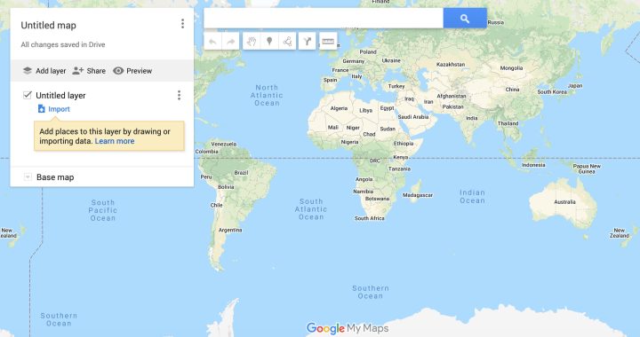
Google My Maps
A popular way to visualise data is to display it on a map (obviously this will only work if the data contains geographical information), the following exercise shows how to use the Google Maps Engine to easily plot your data on a map.
- Open Google – My Maps and login
- Click on the ‘Create a New Map’ Button
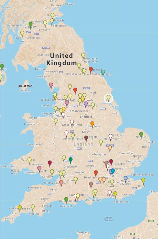
- Download from this Link the data to visualise on your map
- Rename your map ‘British casualties in Afghanistan: 2011 – 2013’
- Click on the ‘Import’ link and upload your spreadsheet of Data
- In the ‘Choose columns to position markers’ window, click on ‘Where From’ and select the ‘Continue’ button.
- In the ‘Choose a column to title your markers’ window, click on ‘Name’ and select the ‘Finish’ button.
- If a notification of error shows up, click on the banner and fix the errors on the data spreadsheet.
- You can change the markers style on your map. Before proceeding, decide if you wish to change the Style for all markers or 1 by one or by columns etc.. To do so, click on ‘Uniform style’ and select a choice from the menu.
- Select the marker you wish to change; a panel will appear showing the marker’s data. Click on the ‘Style’ button at the bottom right and choose how you want your marker to look like (if you kept the ‘Uniform style’ option selected, all the other markers will change too).
- If you wish the markers to show labels: click on the ‘Uniform style’ option > click on the ‘Labels’ button > choose which label on the show on the markers
- To change the Map’s terrain: click on the ‘Base Map’ button and select a terrain that you like
- When finished, you can:Share: click on the ‘Share’ button > activate the options ‘Anyone with this link can view’ and ‘ Let others search for this map on the internet’ > Copy the shareable link > Close > send the link to show your work.Embed: if you wish to add the project to a website / WordPress post > after clicking Embed, copy the HTML code that will appear in the window > go to WordPress > open your post > Text view > Paste the code.
If you wish to practice more, create another Custom Map, using this Google Exercise with two layers of data.
Interactive Timelines
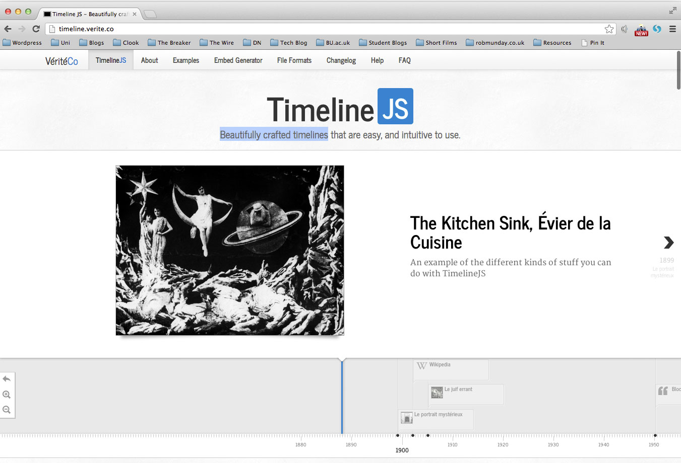
Timelines are a great way of presenting data that happened over a certain period of time. To create a timeline view the following exercise using TimelineJSCreate beautifully crafted timelines by simply filling in a Google Spreadsheet and using timeline.verite.co
TimelineJS can pull in media from different sources. It has built in support for:
Twitter, Flickr, Google Maps, YouTube, Vimeo, Dailymotion, Wikipedia, SoundCloud and more media types in the future.
Additional Reading
www.davidmccandless.com
“I’m a London-based author, data-journalist and information designer, working across print, advertising, TV and web.
My information design work has appeared in over forty publications internationally including The Guardian, Wired and Die Zeit.
In recent years, I’ve been exploring the use of data visualisation and infographics to explore new directions for journalism and to discover new stories in the seas of data surrounding us”.